 Multi-Brand Design System
Multi-Brand Design System
Multi-Brand Design System
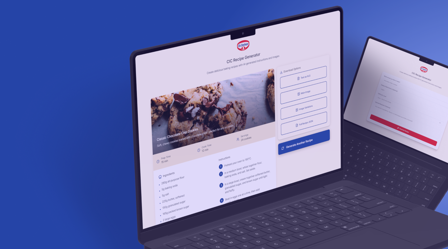
Before touching Figma, we audited every brand's existing product component by component — mapping shared patterns, identifying meaningful differences, and defining where standardisation made sense versus where flexibility was non-negotiable.
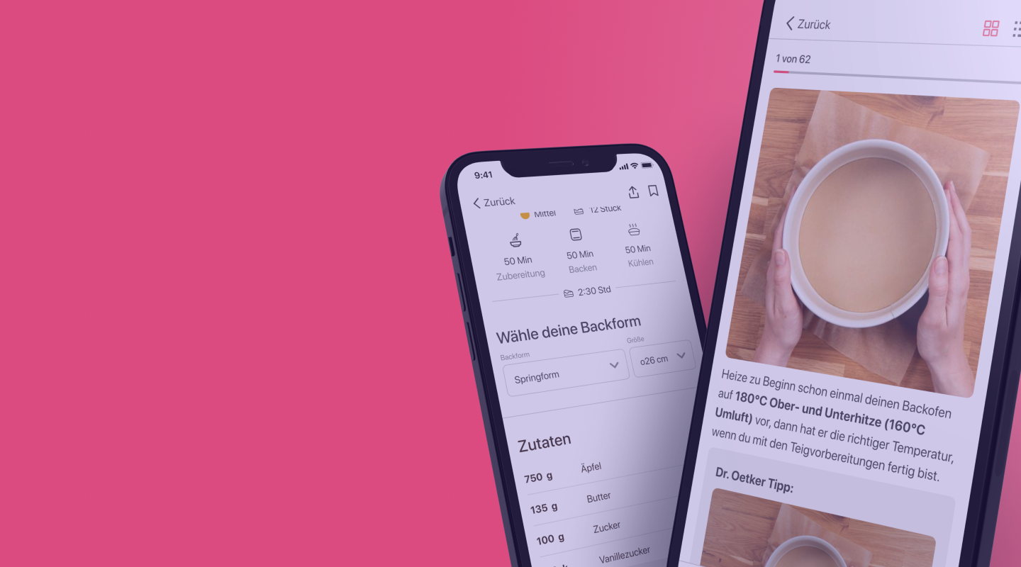
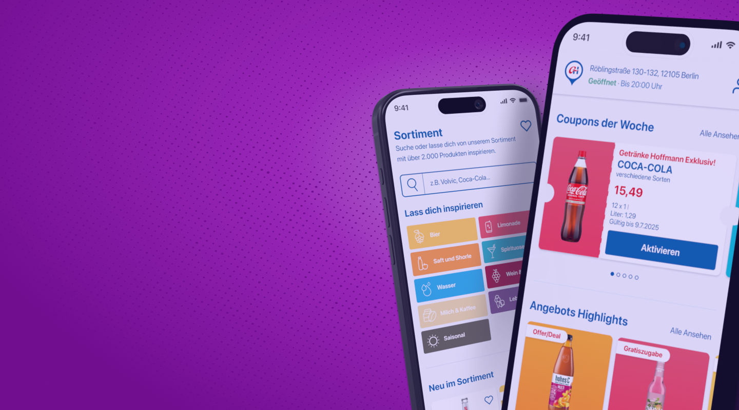
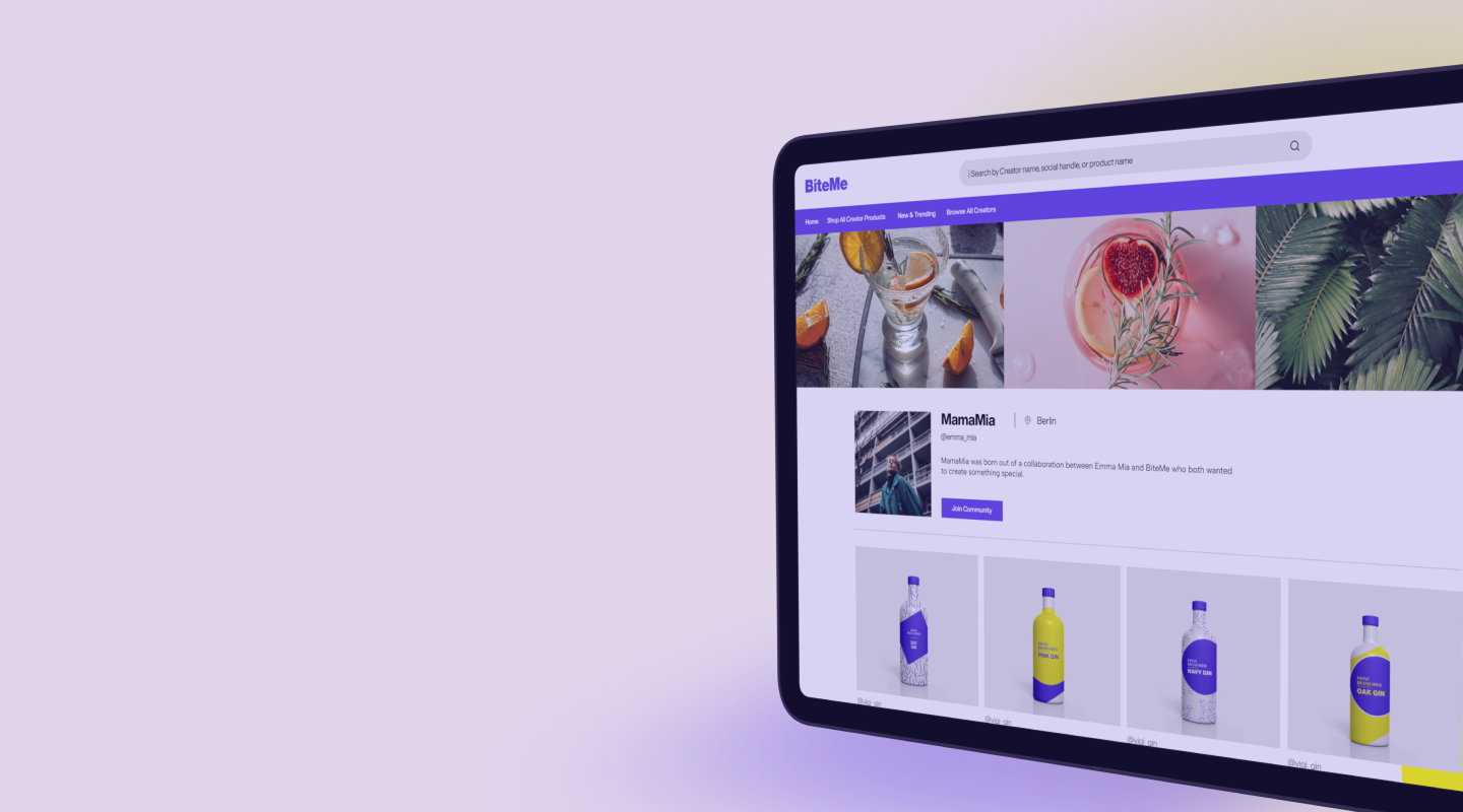
The audit revealed that the majority of components could be shared across brands — which allowed us to focus differentiation effort on what truly mattered: colour, typography, and a handful of brand-specific elements like hero imagery and iconography. This decision shaped the entire architecture of the system and laid the foundation for a scalable multi-brand design system.
We built the entire system in Figma Enterprise, working in close collaboration with frontend developers to ensure every component, token, and naming convention translated directly into code. The challenge wasn't just design — it was making sure both sides spoke the same language.
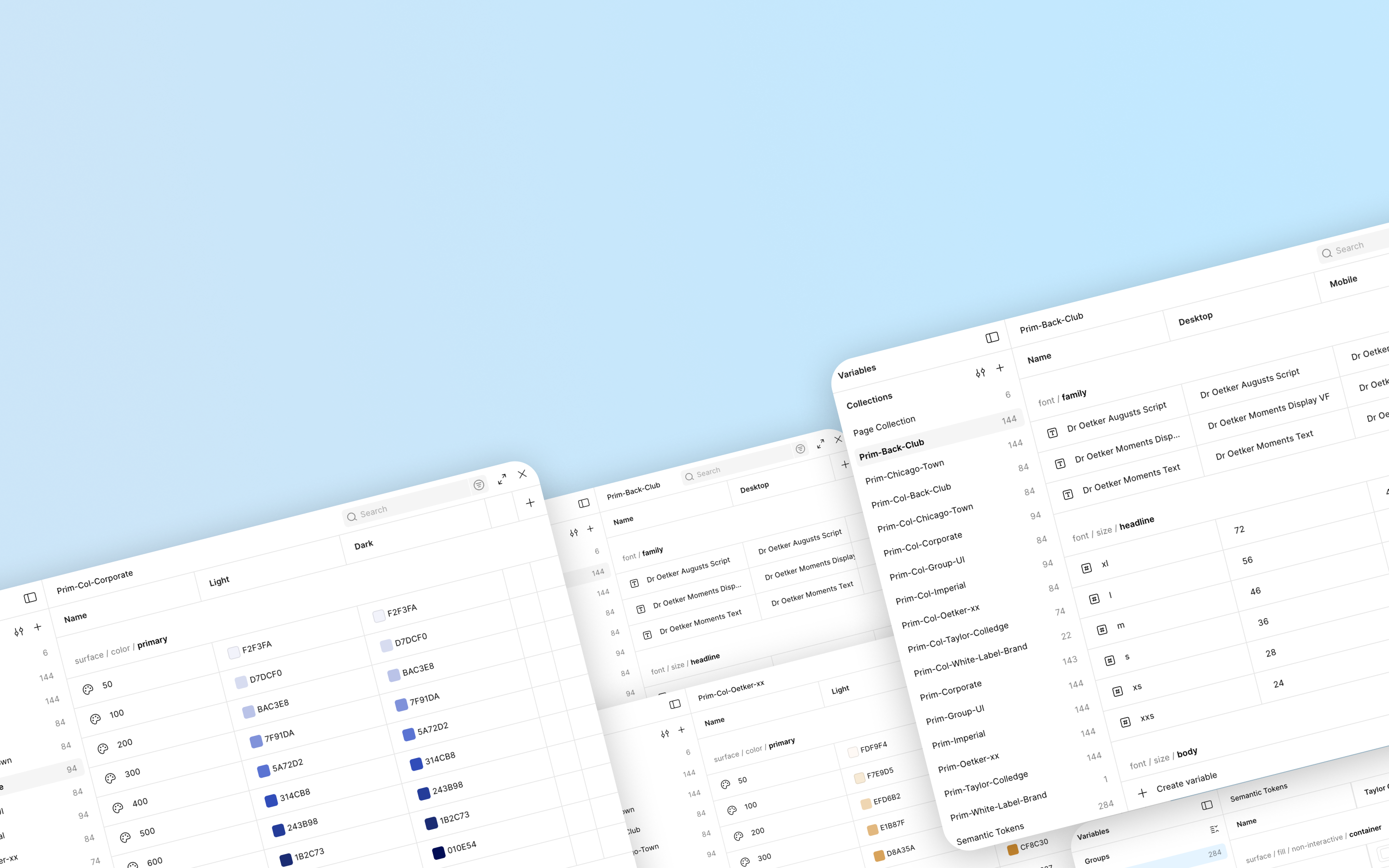
Every brand-specific detail — colours, typography, radius, spacing, shadows — lives in variables. Change the variables, change the brand. The components take care of the rest.
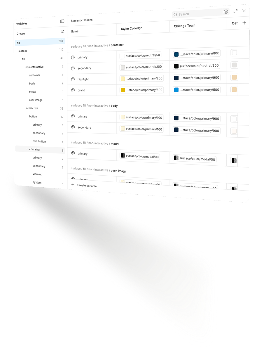
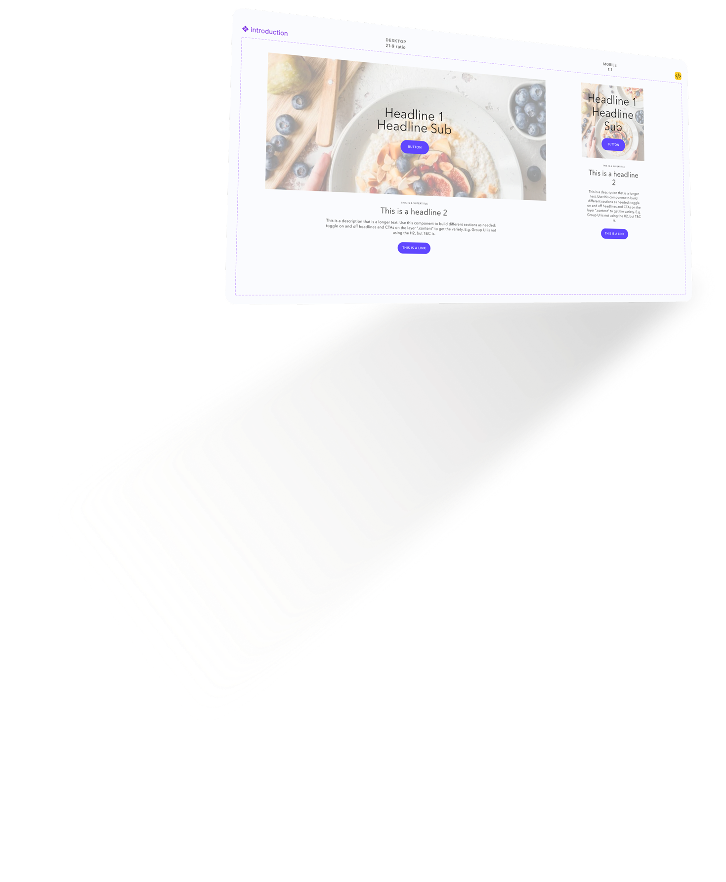
Every component is built on unbranded tokens and designed with auto-layout, so it adapts perfectly regardless of brand. Font sizes, CTA padding, spacing — everything flexes automatically when brand variables are applied.
5
Brands Unified
One shared framework
1 Team
Central Team
Manages all 6+ brands from one place
✓
Design Consistency
Unified visual language across 5 brands
100k+ €
Saved Annually
Agency spend eliminated