This is a personal project of mine, This is far from finished and I didn’t invest much time in it, might get back to it at a later date.
Thinking ahead and observing how things are evolving nowadays, we want to think what might happen when retailers won’t have “paper brochures” anymore, this is also a great way to get in touch with brands that don’t necessary have brochures. This layout can any kind of content coming from our customers’ feeds.
Because of the content quality and the fact that we want to keep everything fully automated, we currently aren’t able to have a live version that looks like the first image and had to settle for a simpler version (second image).
Offering retailers a placement that would be entirely branded to them (sort of their website on our platform) which we know is something that will please them as well as our users that are interested in only a few retailers, now they can navigate through all the content their favourite retailers have to offer.
A tool that would improve the way our clients keep track of their campaigns and make it easy for them to book upsells.
A few illustrations I worked on either for fun or for some in-app screens (onboarding, empty screens…) I don’t work on illustrations as much as I used too when I was working on infographics but it is always fun to get back to it from time to time.
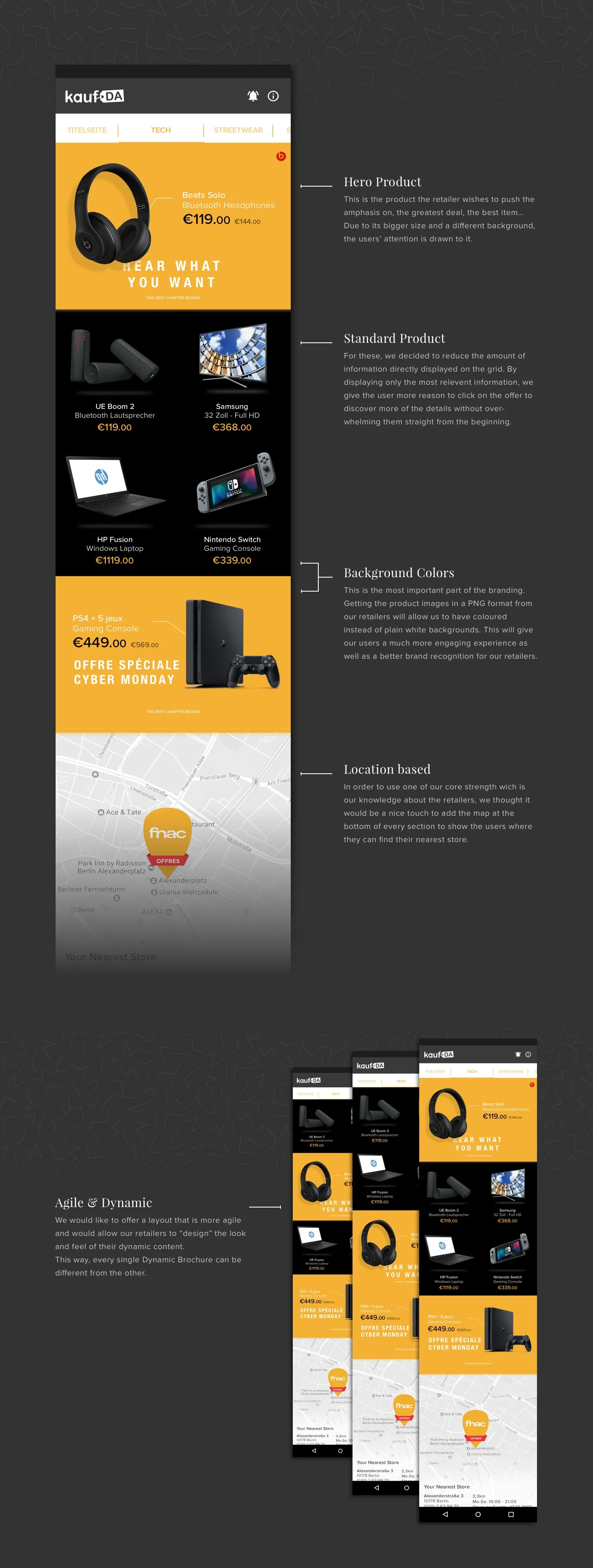
Enhancing the user experience, the discovery and personalisation should be key in order to increase our user retention.
We have been displaying our content the same way for a long time now, how can we make this better, show the users content that is relevant to them fast, but still have them want to spend more time on the platform and thus increase their amount of impressions.
Designed these posters as gifts for friends as well as to decorate my flat. Complete personal project, just for fun :)